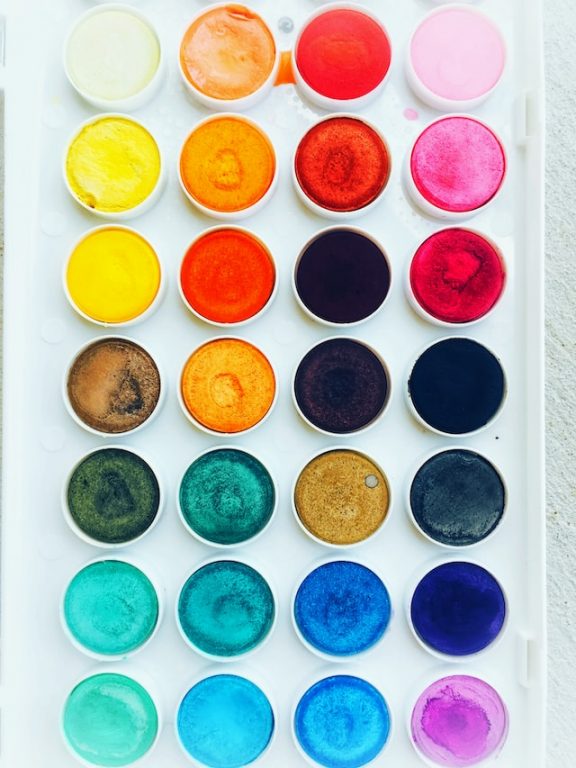
A template color palette refers to the specific collection of colors used in a template. It often includes a main color, which is used as the dominant color, as well as several secondary colors that are used for accents or background elements. The colors in a template color palette are chosen to complement each other and create a consistent look and feel for the design.
In web design, a template color palette can be specified using CSS code, allowing designers to easily change the colors throughout the website by making a single change to the code. In graphic design, a template color palette is typically defined using specific RGB or CMYK values, which are used in image editing software such as Adobe Photoshop or Illustrator.
Having a defined template color palette helps ensure consistency and cohesiveness across a design, making it easier to maintain a consistent brand identity and visual style.
Choosing a template color palette involves selecting colors that will work well together and support the overall design. Here are some tips to help you choose a template color palette:
- Consider your brand identity: If you have an existing brand identity, choose colors that complement or match your brand colors.
- Consider the context and purpose of the design: The colors you choose should support the mood, tone, and message you want to convey. For example, cool colors like blue and green can convey a sense of calm, while warm colors like red and yellow can convey energy and excitement.
- Use color theory: Color theory can help you choose colors that work well together. For example, you can use complementary colors, such as blue and orange, to create a high-contrast look.
- Start with a color scheme: There are several color scheme options to choose from, such as monochromatic, analogous, triadic, and complementary. These schemes can provide a starting point for your color palette.
- Consider accessibility: Make sure the colors you choose are easily readable, especially for users with color blindness or other visual impairments.
- Test and adjust: Don’t be afraid to experiment with different color combinations and adjust your palette until you’re happy with the results.
Choosing a template color palette is an important step in the design process, as it sets the tone for the entire design. Take the time to carefully consider your options and choose colors that work well together and support your design goals.