Color theory forms the foundation for the primary principles and guidelines that govern the use of color in creating visually appealing designs. By comprehending the basics of color theory, you can gain a deeper understanding of the logical structure of color and apply it more effectively in creating and utilizing color palettes. The outcome is the ability to evoke specific emotions, moods, or aesthetics.
Color plays a critical role in design, and can shape the meaning of text, affect user navigation and shape their emotional experience. Through an understanding of color theory, designers can intentionally create visuals that have a lasting impact.
Choosing the appropriate color combination may appear simple, but when faced with a color wheel, having background knowledge becomes crucial. Brands of all sizes utilize color psychology to understand the impact of color on decision making and design.
Knowing how colors interact, the impact they can have on emotions and mood, and how they change the appearance and atmosphere of your website is crucial to help you differentiate yourself in a positive way.
From impactful call-to-actions to increased sales and marketing success, the right color choice can highlight key areas of your website, improve navigation for users, and create a sense of familiarity from their first visit.
However, blindly choosing colors is not enough for success. From color theory to moods and schemes, finding the proper HTML color codes, and determining web-friendly colors for products and websites, the more you understand about color usage, the higher your chances of success.
Color Theory and The Color Wheel
Let’s revisit the basics of color, starting with the concept of primary, secondary, and tertiary colors from art class.
These color categories play a vital role in comprehending all other aspects of color.
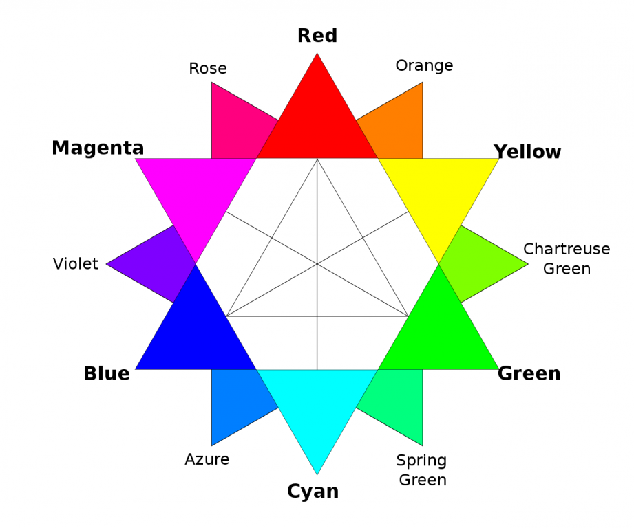
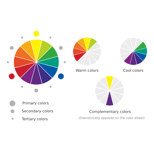
Primary Colors
Primary colors are fundamental to the color wheel and can’t be derived by mixing other colors. Just like prime numbers, primary colors are unique and can’t be obtained by multiplying other numbers.
There are three primary colors:
- Red
- Yellow
- Blue
Primary colors serve as the foundation for your color scheme, serving as a starting point for creating various shades, tints, and tones. These colors set the boundaries for your brand and provide a guide as you experiment with other color options.
When working with primary colors, don’t limit yourself to only the traditional red, blue, and yellow. You can also incorporate other colors, such as orange, as a dominant color in your design. The use of primary colors provides a foundation and guidelines for exploring other shades, tones, and tints in your color scheme.
Secondary Colors
Secondary colors are created by mixing two primary colors together. For example, when red and yellow are combined, they create the secondary color orange. Similarly, blue and red yield the secondary color purple, and blue and yellow form green.
Tertiary Colors
Tertiary colors are created by combining a primary color with a secondary color. However, not every combination of a primary and secondary color will result in a tertiary color.
The Meaning of Colors
Different colors carry distinct emotional symbolism and evoke different feelings. Red symbolizes power, passion, and energy and can prompt action. Orange evokes joy and excitement, making it a good choice for positive messaging. Yellow signifies happiness and intellect, but caution should be taken in overusing it. Green is linked to growth and ambition, and can give a sense of rising success. Blue represents tranquility and confidence, with lighter shades inspiring peace and darker shades conveying confidence. Purple signifies luxury and creativity, but should be used judiciously. Black symbolizes power and mystery and can help create necessary negative space. White is associated with safety and innocence and can help simplify your site.
Choosing Template Color Palette
Selecting the right color palette is crucial in creating an impactful design. Understanding color theory and the color wheel will aid in exploring the relationships between colors, their combination and gradient effects, and the emotions they evoke. Whether you prefer using bold, vibrant, or soft colors, finding the right color scheme is a key aspect of website design.
Colors play a crucial role in shaping the emotions and perceptions of people who view them. By carefully choosing a color scheme, businesses can influence their audience’s emotions and create a more impactful brand message.